


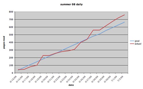
Paul B suggested I make a graph for C's summer reading & I just did -- this is perfect. Highly motivating (to me, at least).
Haven't shown it to C yet as he appears to be avoiding me.
Possibly because we got started on Analyse, Organize, Write and Sentence Combining Workbook yesterday.
9 comments:
What is a "stacked chart"?
Hi,
Nice curves.
I was hope you could answer the following questions:
How are you using Analyse, Organize, Write, and Sentence combining workbook?
what age are your children?
how is it being received?
I wonder how long it took for moveable type to displace story telling as a primary means of passing on knowledge? Seriously.
It just so happpens that I am married to a historian!
I'll go ask.
Ed, btw -- I think I'm remembering this correctly -- thinks the internet may have parallels to the invention of the printing press in terms of the "revolutionary" effect on people's thinking and politics. (Take that with a grain of salt; that conversation happened a while back.)
The NYTIMES op-ed was interesting because he heard from people all over the place. These are history buffs, it seems - people with an avid interest in history who know exactly how many Statues of Liberty there are in France.
He also heard from people whose last name is "Berenson." There aren't too many of them around.
Before the internet, this wouldn't have happened.
"Stacked Chart"
Could be a chart made with biased data :/{
Or it could be a pile of charts churned out while experimenting with excel :\}
But I think what you might be referring to is usually called a stacked bar chart. It's just a bar chart where each bar is further broken down into some component parts. Each component is a different color, hence the look of 'stacked' bars.
An example might be if your whole family was reading every day you could assign a different color to each family member. Then on the x-axis you could put days, while the y-axis would be pages read. Each bar then represents the total pages read by the family for a day and the colors break it down into how much each person contributed.
Wrong expression: it was "stacked line."
For some reason, the "stacked line" chart has different values on the y axis. The non-stacked y-axis goes from 0 to 1000 pages read.
The "stacked line" chart goes from 0 to 1800.
Visually, the "stacked line" chart makes it look as if C. has read twice as many pages as he's actually read.
This is the one that goes from 0 - 800:
"Line. Displays trend over time or categories."
This is the chart that looks like C. has read twice as many pages as he has (does the same thing for the chart I made of my own reading):
"Stacked line. Displays the trend of the contribution of each value over time or categories."
I'm using Excel the way kids use calculators...
Right, the two contributions are the actual number of pages read, and the goal. The stacked line graph is adding these together.
David - thanks!
If you're still around, why would a person want this information?
Would it benefit me?
Offhand, I don't see how it would -- but I haven't thought about it.
Are there "typical" situations in which you want to know the actual+goal?
I don't think you would want to know actual+goal. A stacked line chart would be appropriate if you were tracking a quantity that is a sum of independent parts, and you also wanted to track the contribution of each part. For example, if you were reading books on several subjects at the same time, then a stacked line chart could be used to keep track of how many total pages you had read, and how many pages you had read for each subject.
Oh, of course!
This is another example of inflexible thinking when you've just started something --- I was thinking "actual" and "goal" were Eternal Categories!
sheesh
A stacked chart would work great for me because I tend to read more than one book at a time.
Post a Comment